UX Case StudyAges 5–10Android · On-Device AISolo · 5-day sprint

SnapTale:
a privacy-first AI storyteller children can use without typing.

SnapTale is an Android app that turns a child's photo into a narrated story entirely on-device. I designed and built it in five days to test whether generative AI can support curiosity and early literacy without cloud uploads, subscriptions, or text prompts.

Research → Design → Build → Closed Testing · Shipped in 5 days

Mood selection
Capture
Story output
Scroll the process
00Project at a Glance

A privacy-first storyteller,
built by one person, for small people.

I set out to answer one question: can a child aged 5–10 turn the world around them into a story — instantly, infinitely, and without ever sending a photo to a cloud?

Over a 5-day solo sprint I ran lightweight research, shipped to Play Store closed testing, and iterated with a handful of friends and their kids.

Role
Product Designer & Engineer
Solo — end-to-end
Timeline
5 Days
Research → Closed beta
Platform
Android
On-device AI · Offline
Status
Closed Testing
Play Store · internal track
Phase 01

Discover — before any pixel.

Light-touch research, two personas, the signals that reframed the brief.
01Research Approach

A focused 5-day sprint
scoped for one defensible product bet.

Proper research takes weeks. I had days. So I ran lightweight, mixed-method research — scoped to produce one defensible insight, not a thesis.

01
Desk scan
~1 afternoon

Quickly read up on early literacy and narrative competence in ages 5–10. Just enough theory to ground the brief — not a lit review.

02
Parent chats
4 friends

Informal conversations with parents in my circle. Topics: screen-time guilt, subscription fatigue, what their kids actually use.

03
Competitive teardown
3 apps

Heuristic walkthrough of the top photo-to-story and kids' storybook apps. Captured friction, pricing model, and privacy posture.

04
Observation
1 weekend

Watched a 5-year-old I know point at things in a garden for an hour. That one afternoon became the core insight.

Synthesis
Three signals kept repeating — parents fear cloud uploads, kids chunk choices into four or fewer, and curiosity happens at home, in bursts.
02Personas

Two users in one home
one curious, one cautious.

Aarav, 5
Primary User · The Curious One
"Why does the leaf curl? Is it sleepy?"
Goals
Turn what he sees into a story his family will love.
Behaviours
Points, asks, repeats. Can't type. Can tap a big button.
Constraints
Pre-reader · short attention · small motor precision
Delight triggers
Surprise, animals, repetition, silly voices
Priya, 34
Gatekeeper · The Cautious One
"I don't know what happens to his photos once they leave the phone."
Goals
Encourage literacy. Minimise passive screen time. Keep data private.
Behaviours
Screens every app before installing. Cancels subscriptions fast.
Constraints
Time-poor · subscription-fatigued · privacy-aware
Decision drivers
Transparency, cost, educational credibility
03Key Insights

Four insights
that reframed the brief.

01

Curiosity is local, bursty, and private.

Most ‘what is that?' moments happen at home or in the garden. A cloud dependency would kill the moment and the trust.

02

Parents reject subscriptions faster than ads.

Monthly pricing drew instant skepticism. A one-time, zero-cost model reframes the value proposition entirely.

03

Pre-readers can choose — between 3 to 5 icons.

More options collapsed confidence. Hick's Law applies harder to this age group than to adults.

04

Waiting is fine — if there's a character to watch.

Kids didn't mind the 30–180s compute as long as something alive was on screen.

Phase 02

Define — the real problem.

Problem statement, dual JTBD, and the success criteria I held myself to.
04Problem · JTBD · Success

Sharpening the problem
where three constraints collide.

The Problem

Kids spend 4–7 hours daily on screens, but they're learning less than ever.

YouTube, reels, and games are highly addictive with low educational value. Parents feel they've lost control over what their children consume — and none of the existing alternatives hold.

  • Blocking appsTemporary fix at best.
  • EdTech appsKids lose interest quickly.
  • AI toolsUnsafe and internet-dependent.
Privacy
No cloud uploads — safe by default.
Cost
$0 per story, forever — no inference bills.
Cognition
Designed for pre-readers, small motor control.
What good looks like
  • A 5-year-old can go from open-app to finished-story unaided.
  • A parent can verify ‘no data leaves the phone' in under 10 seconds.
  • The app remains useful offline, on the first day, on any mid-range device.
Child's JTBD
"When I see something cool, I want to turn it into a story I can share."
Parent's JTBD
"I don't want to remove screens. I want to fix what's on them — and no safe, offline AI experience currently exists for my child."
Phase 03

Ideate — sketch, score, choose.

How Might We questions, a Crazy-8s round, and an impact/feasibility filter.
05Ideation

From many sketches
to one concept I could ship.

I ran a solo Crazy-8s session, wrote four "How Might We" questions, and scored concepts against an impact × feasibility 2×2. Only one concept cleared all four HMWs.

How Might We
  • 01How might I let a pre-reader start a story with one action?
  • 02How might I make a 90-second wait feel like part of the play?
  • 03How might I signal ‘your data never leaves' without writing a word of policy?
  • 04How might I keep decision-making to 4 choices without losing expression?
Winning Concept

One shutter, four moods, an on-device storyteller.

A single-tap capture → a 4-mood picker → a visible on-device compute phase with a companion character → a narrated story saved to a visual library.

Phase 04

Architect — structure and flow.

Information architecture, user flow, emotional journey, and wireframes.
06Information Architecture

A shallow tree
two tabs, five screens.

For a pre-reader, depth is the enemy of orientation. I settled on two tabs (Capture, Library) with a single linear flow under each — no hidden menus, no modals that trap.

SnapTale
Capture tab
  • Camera
  • Mood picker
  • Processing
  • Story reader
Library tab
  • Grid view
  • Search / Favourites
  • Story reader

Max depth: 3 · Average taps to first story: 3

07User Flow

Five screens,
zero dead ends.

A linear, progressive-disclosure flow. I rejected tabbed navigation mid-flow — it broke the story arc mental model for a 5-year-old.

Happy path
Capture → Mood → Process → Story
Exit any time
Back-tap returns to Capture, never loses work
Re-entry
Library → tap thumbnail → Story reader
01
Capture
Capture
One tap. No upfront decisions.
02
Mood
Mood
Choose from 4 curated tones.
03
Process
Process
Transparent, on-device compute.
04
Story
Story
Narrated, highlight-synced reward.
05
Library
Library
Habit loop via recognition.
08User Journey Map

An emotional arc
not just a flow of clicks.

Flows tell you where the child taps. A journey map tells you where the child is emotionally — and surfaces the risk zones a tap count can't see.

0
25
50
75
100
Risk zone
Step 01
Sees something cool
Curiosity
Step 02
Opens app
Anticipation
Step 03
Taps shutter
Agency
Step 04
Picks mood
Expression
Step 05
Waits (30–180s)
Patience / drift
Step 06
Hears the story
Delight
Step 07
Saves / returns later
Pride

The dip at ‘Waits' is the highest-risk moment in the whole flow. Every design decision on the Processing screen is an answer to that dip — not to a technical problem.

09Wireframes → Hi-Fi

From a rough box
to a testable screen.

I sketched lo-fi wireframes first, then iterated in greyscale before touching colour. The progression below shows the Capture screen's three design stages.

01 · Pencil wireframe
Viewfinder

A single dominant circle. No toggles, no filters, no gallery button.

02 · Greyscale mid-fi

Contrast and hierarchy validated before any colour lands.

03 · Hi-fi · shipped
Capture hi-fi

Yellow tab-bar added only after contrast and hierarchy were proven.

Phase 05

Design — principles in practice.

A minimal design system, the HCI laws behind each screen, and the screens themselves.
10Design System · minimal

Just
enough tokens to stay consistent.

Typography
Story title28/32 · Semibold
Story body for emerging readers18/27 · Regular
UI Label11 · 0.22em
Colour tokens
Cream
Paper
Ink
Blue
Sky
Sun
Soft
Line
Spacing & Tap Targets
48dp
Min tap
64dp
Mood card
88dp
Shutter

Tap targets sized against the 99th-percentile thumb reach for ages 5–10. Spacing scale follows a 4/8/16/24/32/48 step.

Motion
  • Easecubic-bezier(0.22,1,0.36,1)
  • UI transition200ms
  • Reveal900ms
  • Reduced motionrespected
11Design Principles

HCI laws
applied to a 5-year-old's world.

01
Hick's Law
Decision complexity reduced — 4 emotionally distinct moods, no menus.
02
Fitts's Law
Shutter sized to the 99th-percentile thumb reach of a 5-year-old (≥72dp).
03
Progressive Disclosure
Every screen reveals exactly one decision. Nothing upfront.
04
Visibility of System Status
Inference is visible, narrated, and humanised — never a spinner alone.
05
Recognition over Recall
Library uses thumbnails; titles are derived, not authored.
06
Aesthetic–Usability Effect
Warmth in typography and motion increases perceived trust for parents.
12Capture · Fitts's Law
Capture screen
Fitts's Law · Motor

One dominant action,
sized for a tiny thumb.

The shutter is the only interactive element on screen. Sized for the 99th-percentile thumb reach of ages 5–10, with no competing controls.

  • No hesitation — only one thing to tap.
  • Camera-first layout matches the mental model of ‘a camera'.
  • Avatar moved away from the shutter after closed-beta false-taps.
13Mood · Hick's Law
Mood selection screen
Hick's Law · Chunking

Four moods,
one decision.

Pre-readers chunk into groups of 3–5. Four options kept task success high. Each option uses an icon-first, word-second format so pre-readers can choose without reading.

Wonder
Bedtime
Adventure
Funny
14Processing · Trust + Time
Processing screen
Doherty Threshold · Labor Illusion

A wait becomes
a pre-show.

On-device inference takes 30–180s. Instead of hiding latency, I narrate it — invoking the Labor Illusion (Buell & Norton, 2011): visible effort increases perceived value.

Status visibility
Live percentage, stage labels, a calm ETA band.
Emotional buffering
A looping companion character reduces perceived wait.
Expectation setting
‘Usually 30–180 seconds on device' — honest and calibrated.
15Story · Early Literacy
Story reading screen
Early Literacy · Dual-coding
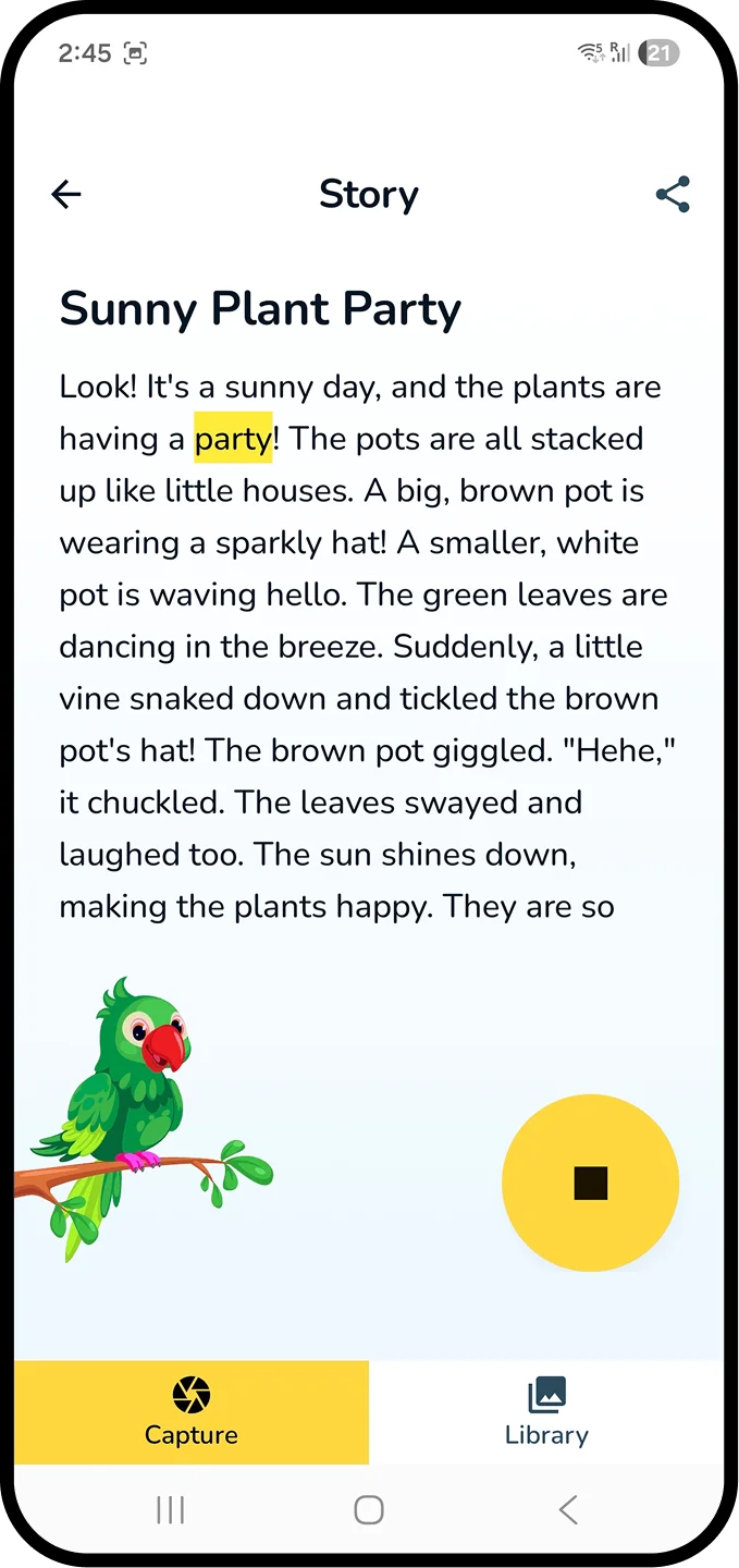
Karaoke words
meet a human voice.

The story screen serves emerging readers first — TTS narration with word-level highlighting, pause / replay per sentence, and a reading-pace slider for parents.

  • Typography sized for ages 5–10 (18pt body, 1.5 line-height).
  • Highlight colour tested against dyslexia-friendly contrast ratios.
  • Optional audio replay became the most-used feature in the first days.
16Library · Habit Loop
Library screen
Recognition > Recall · Variable Reward

From one-shot toy
to bedtime ritual.

The library converts SnapTale from a novelty into a habit. Stories are thumbnail-first, and a soft ‘New' chip introduces a light variable-reward cue without gamification pressure.

  • Thumbnail-based recall — recognition over recall (Nielsen #6).
  • Dates & auto-derived titles provide lightweight organisation.
  • Re-listens are the single clearest signal that the habit is forming.
Phase 06

Test — watch before you believe.

Closed Play Store beta, observed sessions, a heuristic self-audit, and a simple iteration log.
17Prototyping & Testing

Ship, watch, listen
then iterate twice.

With 5 days on the clock, I skipped formal lab usability sessions. Instead I ran closed beta on Play Store's internal track and observed live sessions with kids I know.

SnapTale prototyping and testing evidence
Method
  • Closed Play Store betaSmall internal track with friends.
  • Observed sessionsWatched 3 kids use the app with a parent present.
  • Heuristic self-auditNielsen's 10 applied by me to each screen.
Participants · Closed Beta
3
Kids observed (5, 6, 8)
5
Parent testers
2
Rounds of fixes
What I'm tracking
  • Time from open → first story
  • Unaided task success rate
  • Single Ease Question (SEQ)
  • Parent-reported trust (1–5)
  • Re-listens per story per week

Quantitative benchmarks will be reported after public launch.

Iteration log · what changed and why
High
Kids tapped the profile avatar thinking it was the shutter.
Moved avatar to top-right corner, reduced contrast, enlarged shutter.
High
Parents didn't notice the ‘on-device' claim on processing screen.
Added explicit ‘No data leaves this phone' microcopy with a shield icon.
Medium
Story body felt dense for pre-readers.
Increased line-height; introduced word-level highlighting synced to TTS.
Medium
Kids drifted during long compute waits.
Added a looping companion character and progress narration.
Low
‘New' tag in Library was being tapped as if a button.
Replaced with a non-interactive chip and muted the contrast.
Phase 07

Deliver — and reflect.

Architecture, accessibility, tradeoffs, closed-beta voices, what's next, and what I'd do differently.
18Technical Architecture

Turning a constraint
to a UX decision.

Running the full inference pipeline on-device isn't just engineering — it's the spine of the value proposition for parents.

Stack
  1. 01CaptureAndroid CameraX · 512px buffer (never written to disk)
  2. 02LLM RuntimeLiteRT-LM with 4-bit quantization
  3. 03ModelGemma 3n E2B · fits in <1.5 GB RAM
  4. 04PromptingMood-conditioned templates with age-graded vocabulary guardrails
  5. 05TTSAndroid on-device TTS · karaoke timestamps generated locally
  6. 06StorageRoom DB · fully local · encrypted via Android Keystore
Why On-Device
  • No PII ever leaves the device.
  • Privacy-friendly by architecture, not policy.
  • Offline-first — works in the garden, on planes.
  • $0 marginal cost per story — infinite generation.
Runtime Budget
≤1.5GB
RAM
30–180s
Inference
0B
Network
19Accessibility & Inclusion

Designed for difference
from the first wireframe.

Accessibility wasn't a checklist at the end — it was a design constraint that shaped the flow, the type scale, and the motion budget.

WCAG 2.2 AA contrast

Body text ≥ 4.5:1. Story body tested at 7:1 for emerging readers.

Dyslexia-friendly typesetting

Rounded sans, generous line-height, comfortable letter-spacing on story screens.

Motor accommodation

Minimum 48dp tap targets; shutter at 88dp; no drag gestures required.

Dual-modality output

Every story is readable and narratable via TTS with sync'd highlighting.

Reduced motion

Companion animation respects prefers-reduced-motion.

No text-entry requirement

A non-reader can complete the whole flow without typing a single character.

20Tradeoffs

I named every tradeoff
and chose on purpose.

LatencyvsExperience
Embraced visible compute. Narrated, companion-led wait turns a bug into a pre-show.
PrivacyvsCapability
Gemma 3n E2B is smaller than cloud LLMs — but it fits the pocket and the policy.
SimplicityvsFlexibility
Four moods instead of a prompt box. Expression comes from the photo.
CostvsFeatures
$0-forever rules out cloud fallbacks, subscriptions, inference analytics.
21Closed Beta · Snapshot

Shipped.
Measuring as we go.

The app is in Play Store closed testing. Public launch metrics are not published yet, so I am tracking the signals below without presenting placeholder numbers as proof.

Pending
System Usability Scale
Parent trust and usability after public launch
Pending
Unaided task success
Capture to first story, tested with children aged 5-10
Pending
Single Ease Question
Average ease across the core story-making flow
Pending
Repeat listens
Saved-story replays as the early habit signal
0
bytes
User data transmitted off-device
Privacy architecture by design
5
days
Research to Play Store closed testing
Prototype, build, and closed-test setup

Public launch metrics will be published after the first cohort. Until then, the case study shows what is being measured rather than inventing proof.

Early voices from closed testing
"My son pointed to a mushroom on a walk and asked for ‘a story like yesterday.' That sentence alone is why this matters."
Parent, closed tester · kid, 6
"I like that I don't have to decide whether to trust it. There's nothing to trust — nothing leaves the phone."
Parent, closed tester · kid, 4
"He sat through the wait because the pink guy was waving. We're in trouble."
Parent, closed tester · kid, 5
22What's Next

A roadmap
beyond the first release.

The 5-day sprint validated the core loop. These are the directions I want to explore next — each stays true to the privacy-first, zero-cost spine.

01
Co-authoring mode

The child suggests a word; the model weaves it in — extending narrative agency.

02
Voice-led capture

For kids under 5 who point and speak before they tap, enter via microphone instead of shutter.

03
Parent insight card

Weekly, private, on-device summary of vocabulary themes a child explored.

04
Shared physical photo book

Export a month of stories as a printable PDF — offline, nothing sent.

23Reflection

What five days
the sprint taught me.

What I'd keep

The privacy-first architecture as the brief's non-negotiable. It clarified every downstream decision.

What I'd change

I'd run the observation session before the parent chats. The single afternoon with a 5-year-old was more useful than all my reading combined.

What surprised me

Waiting became a feature once it was narrated. Kids treated the compute phase like a pre-show.

What I'd explore next

A co-authoring mode where the child contributes a word and the story adapts — extending narrative agency.

Closing

Stories in the pocket,
of a curious child.

SnapTale is my small proof that child-first UX, privacy-first architecture, and zero-cost AI can live in the same screen — without compromise.